I’ve been a Flickr member since 2005. It was where I really came into my own as a photographer, allowing me to grow, network and learn all sorts of things along the way. I mean, I went from this to this. It’s also a community I outgrew and left behind as I waited in vain for an update to the service. I stopped regularly uploading photos sometime in 2011. But late last month I decided to re-engage with the service as part of a larger experiment with social media and that seems to have been good timing with Monday’s long awaited redesign. This redesign has fixed some of what ails the site and will hopefully re-enegerize and reinvigorate the user base, but as I explored the new layout and functionality, there were some things that stood out as big misses to me.
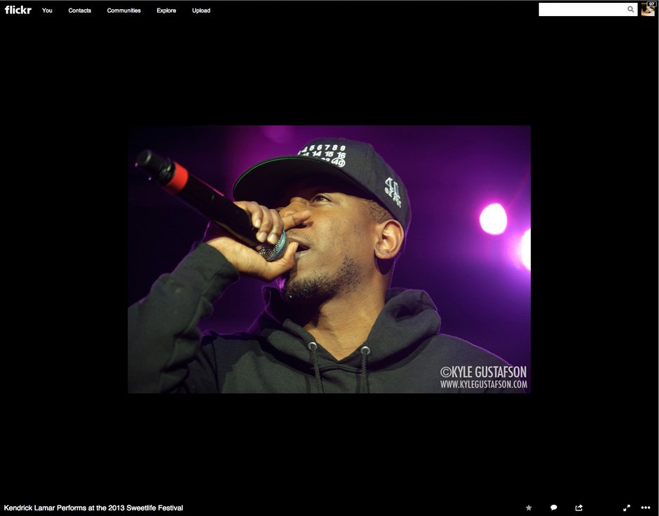
1) The lightbox at the top of the page for the photo is too big. Let’s be frank, the new layout is an improvement from the old version, but it’s not perfect. Here’s a screenshot of a recent upload that is 1000 pixels wide and is still swallowed by the black lightbox portion at the top of the page.
Look at all that black space! Flickr is the anti-Google! Instead of wasted white space, they have wasted black space. What’s the point of all of this padding around the image? It goes without saying that smaller images look even more ridiculous. Look at how Instagram photos look in the new layout. Ugh. I get that Flickr wants you to upload full res images (the make use of your free 1TB of storage), but there should be a setting that allows you to set the default display size you want for your images. This would also help with the next item.
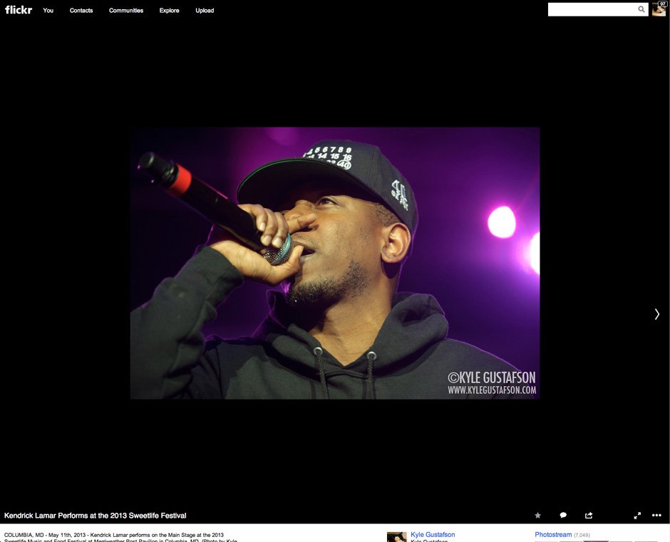
2) All the photo info has been pushed too far down the page. Look at that same Kendrick Lamar photo in a full screenshot:
Keep in mind I am on a 27-inch iMac with a screen resolution of 2650 x 1440. Who took this shot? You can barely see my name! Only one line of the caption is visible. When you elongate your screen, the only thing that expands is this lightbox section. This is just poor design. Comments, favorites, copyright info, metadata info and tags are all below the fold. Again, I’m all for photo first, but there’s no reason for this. Shrink the lightbox section and move these sections up the page.
3) The EXIF data link has been buried in a menu and the info has been moved to another page.
This may not bug other people as much as it bugs me, but part of the reason I fell in love with Flickr when I was starting out as a serious photographer was that I could look at the EXIF data from a photo I liked and see what the settings were. This helped me understand depth of field and so many other photography concepts. This info started out on a click through page and eventually migrated onto the photo page itself, which was ideal. When I’m looking through photos on a band that is coming through town, it’s great to be able to quickly tell what type of lens was used to shoot a particular photo. Now that info is yet again relegated to a separate page, assuming you can find it buried in the menu that’s hidden in the lower right corner.
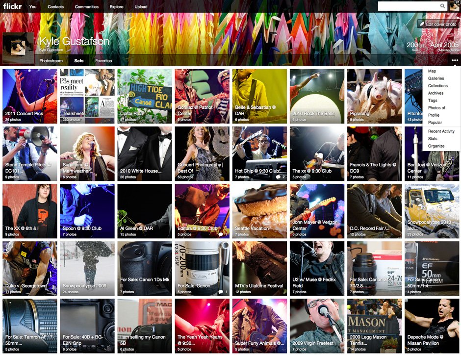
4) I already hate the three dot menu and the way it hides functionality I used on a regular basis.
I can’t speak for you but three little dots on a page does not scream out VERY IMPORTANT MENU to me. Why the empty space in the menu bar after Photostream, Sets and Favorites? Why not populate that space with some of the choices in the three dot menu? Why is the link to my profile buried?
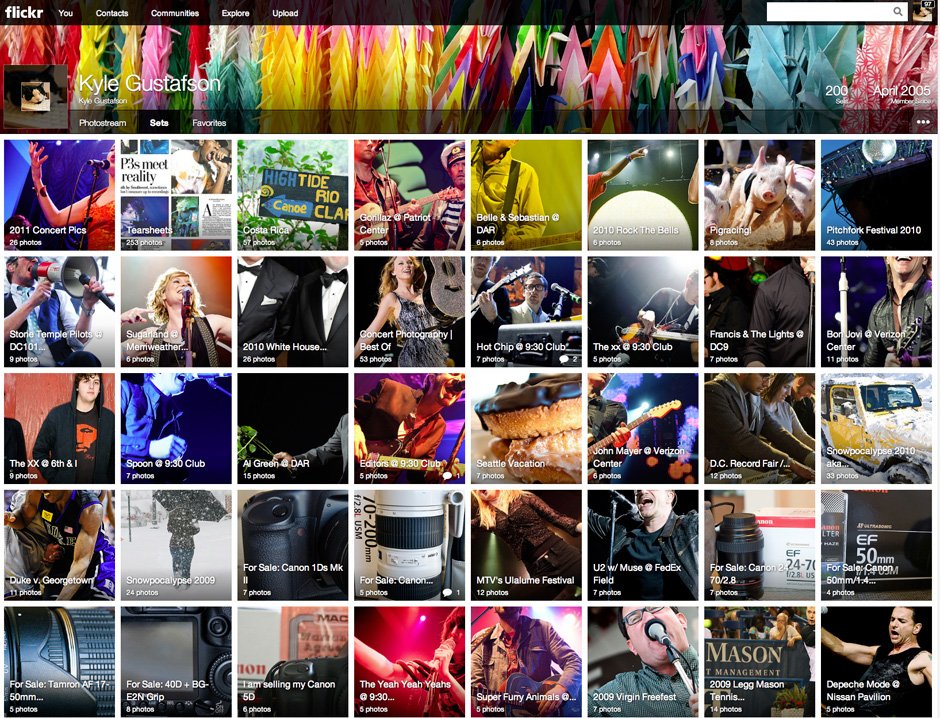
5) The thumbnails on the Sets page were cropped poorly. Look at my page of photo sets. I can barely tell what half of them are and I took the photos.
When I make a new set, I don’t even get to choose the square crop! The system does it automatically and it obvs. does a horrible job. This is a big fail. This should be a page showcasing my best work. Instead I have a photo of two tuxes and bow ties and no faces and a big white orb with an arm sticking out of the frame.
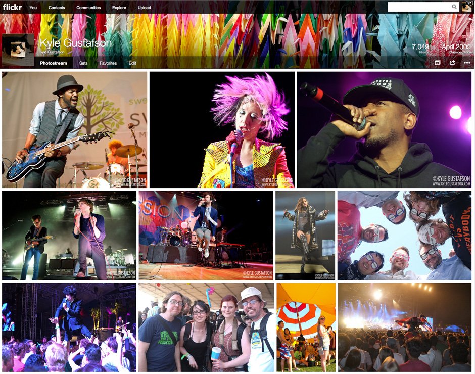
6) Enough with the cover photos.
Facebook and Twitter have done a good job with cover photos (unlike Google+) and other social networks want to copy this functionality. I’s an easy way to personalize your profile or account if done correctly. This was not done correctly. No one takes photos with that height and width ratio, which means you either crop the shit out of a good photo or make a collage out of smaller photos. This shouldn’t be so hard. Can we all agree that full screen cover photos don’t work?
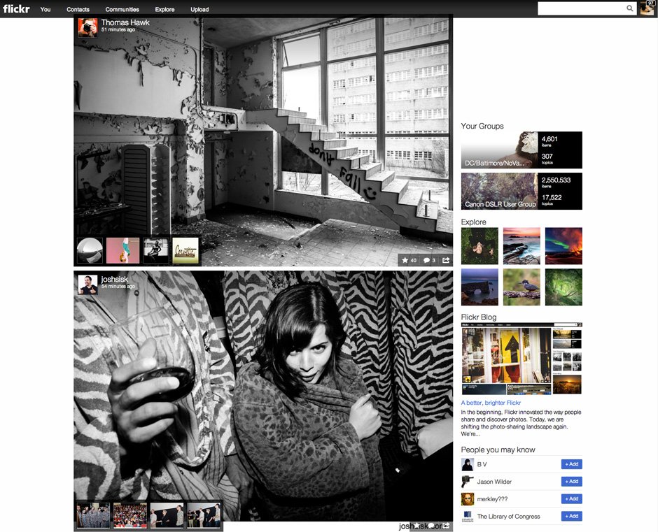
7) I want slideshows in the photo feed from my contacts when I log in.
I really like the new photostream from my contacts when I log in to Flickr. I also really like that it shows me groups of photos so if a contact has uploaded five photos, I see one full sized photo and four thumbnails. That’s cool. But if I want to see a bigger version of one of the thumbnail photos, I have to click away to that photo’s page. I can’t view a larger size right there in the photo stream. I want to cycle through a contact’s new photos right there on the log in page just like a slideshow. That way I can see the new photos on one screen instead of clicking around all over the place.
Lastly, I couldn’t help but notice that there was no update on image security on Flickr. I was going to address that here (security was a big reason I stopped uploading photos to Flickr in 2011 – I was tired of people stealing my images) but I feel like that’s a separate blog post.
What about you? What do you like from the updates? Any other dislikes or improvements?






1 Comment
hemisphire
May 22, 2013 at 2:21 pmAndroid has adopted the three dot menu and that seems perfectly normal to me now.